Guides
Watercolor Portrait from a Photo: Three Styles Compared
How to turn a photo into a watercolor portrait, how our matte, vibrant and standard watercolor styles differ, and the best ways to print the result.
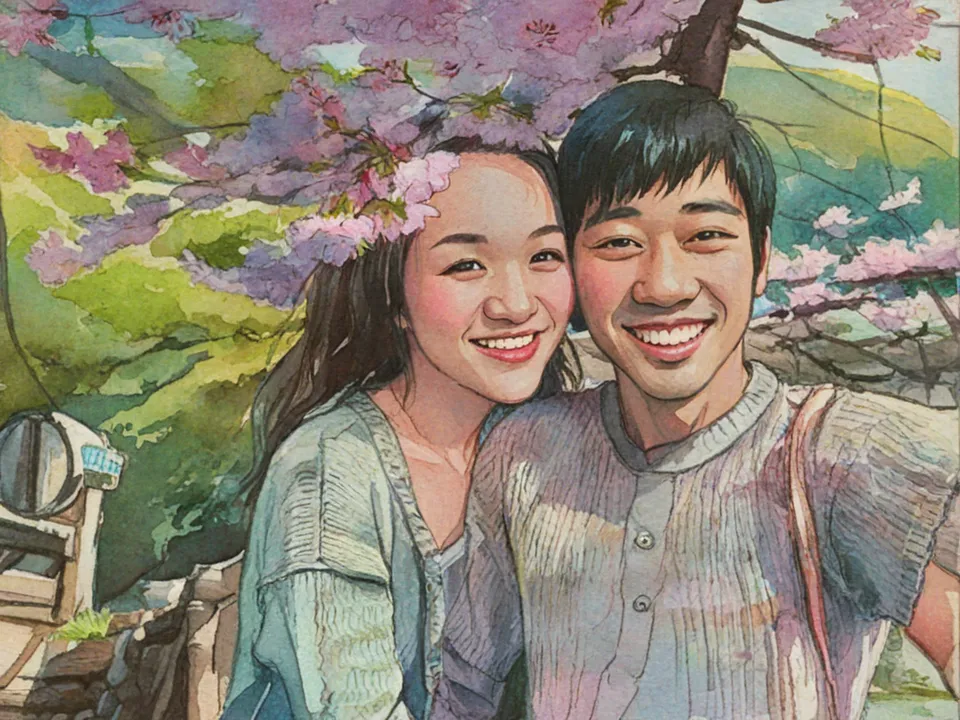
Watercolor is the style people ask for when they want a portrait that feels hand-painted and a little timeless. It flatters almost any subject, from couples and kids to pets, houses and landscapes, and it suits most homes.
We have three watercolor styles, and they give quite different results from the same photo. Here’s how to tell them apart.
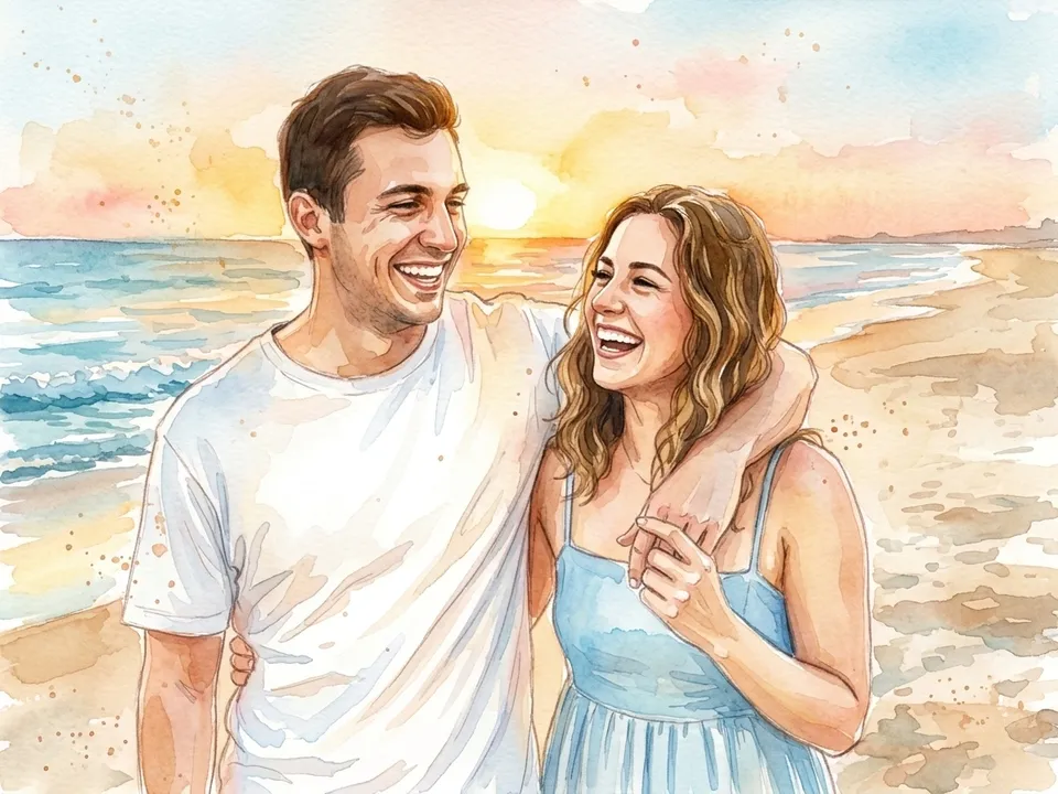
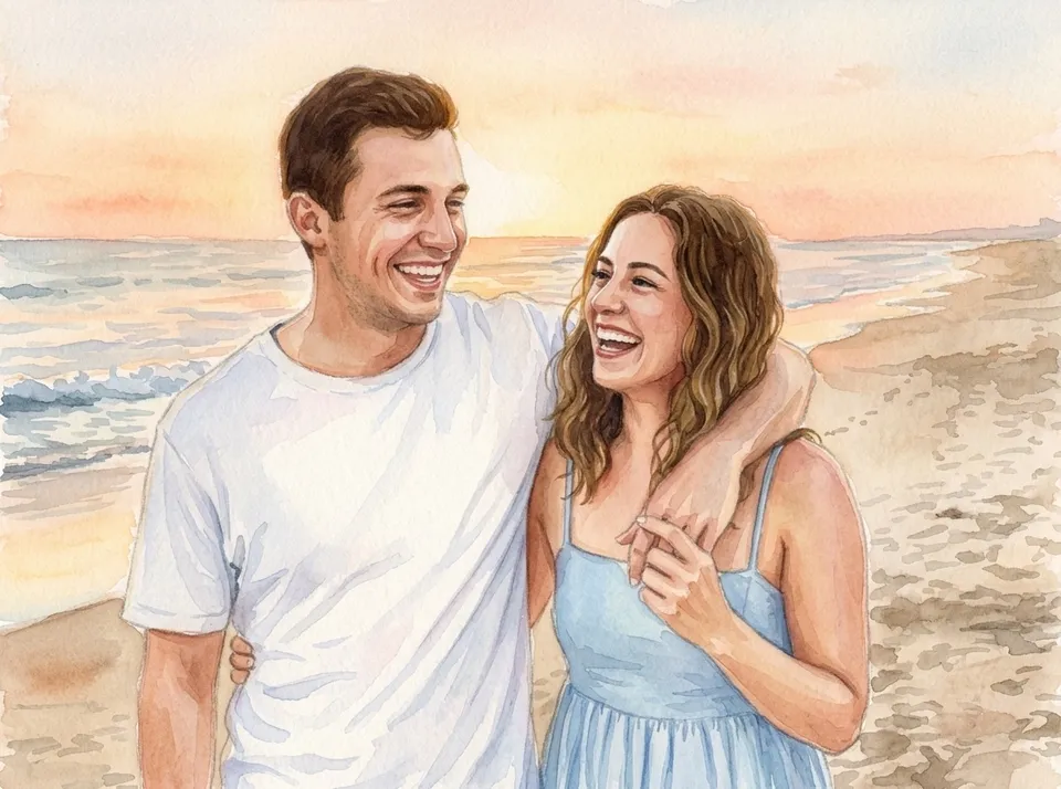
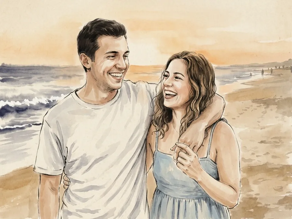
Matte Watercolor: soft and understated
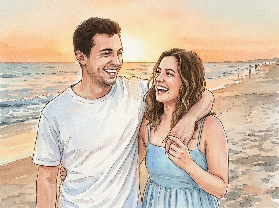
Matte Watercolor combines delicate ink lines with soft, muted washes on a matte paper texture. The line work keeps faces crisp while the colors stay quiet.
Choose it for: wedding and engagement photos, memorial portraits, and rooms with a neutral palette.


Vibrant Watercolor: light and colorful
Vibrant Watercolor uses light, airy brushstrokes and fluid outlines, blending soft pastels with vivid color. It’s looser and more playful.
Choose it for: kids, pets, summer and travel photos, and anywhere you want a pop of color.

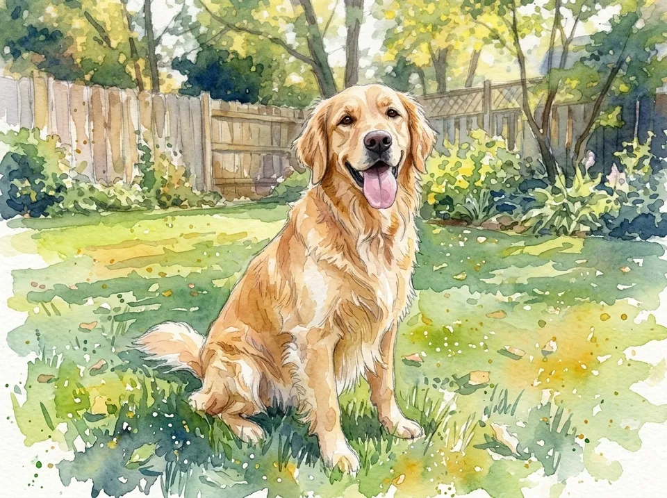
Standard Watercolor: closest to your photo
Standard Watercolor is a simple hand-painted look with soft washes and gentle brush texture that stays close to the original photo.
Choose it for: photos where you want the likeness and the scene kept as they are, like a family home or a group portrait.

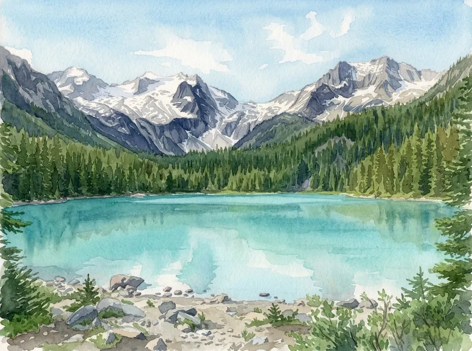
If you like watercolor, also try
- Chinese Painting: expressive brushstrokes and soft ink washes in muted natural colors. It’s lovely for landscapes.
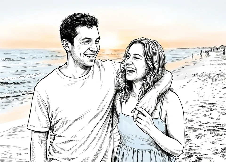
- Sketch: clean black-and-white ink lines with just a hint of color.
- Storybook: warm colors and light line work, like a children’s book illustration.

Photos that work well
- Soft, even light. Photos taken in shade, near a window or on a cloudy day turn into smooth washes. Harsh midday sun leaves hard shadows on faces.
- A simple background. Watercolor looks best with some breathing room around the subject.
- Faces that fill a good part of the frame. Small, distant faces lose detail in a loose, painted style.
The quickest way to choose is to try your photo in two of the three. Previews are free and take under a minute each.
How to print a watercolor portrait
- A canvas print adds texture under the paint and arrives ready to hang.
- A wall poster on matte paper is the closest to a real watercolor on paper, especially in a frame with a white mat.
- An acrylic photo block makes a small portrait for a desk or shelf.
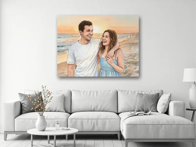
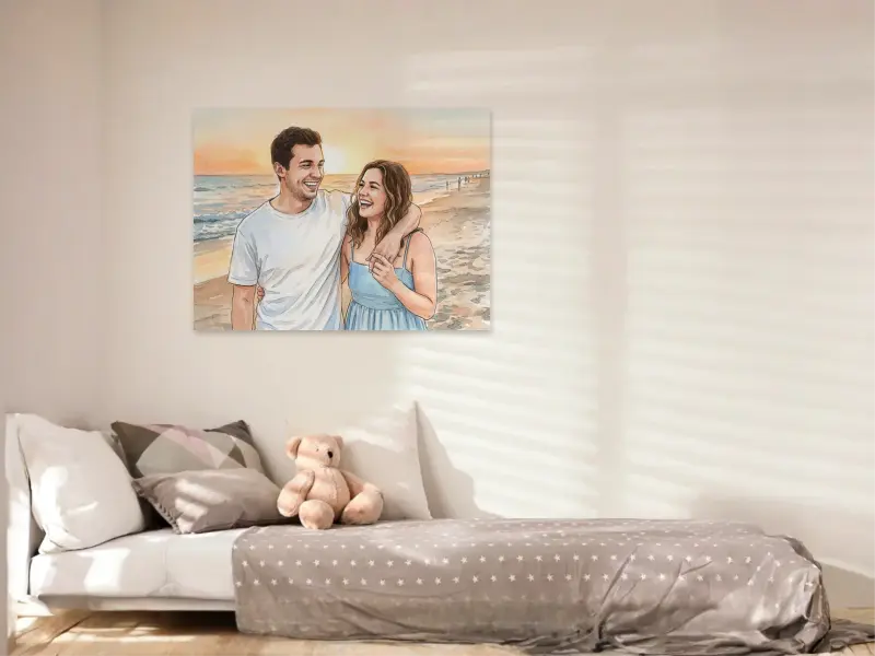
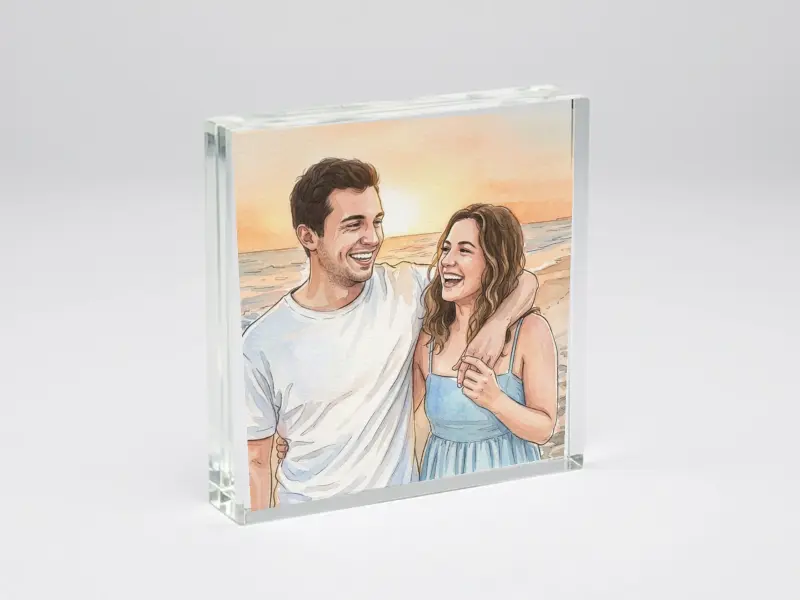
Not sure which of those to pick? See canvas print vs. poster vs. acrylic block.